Aurella.co
Description:-
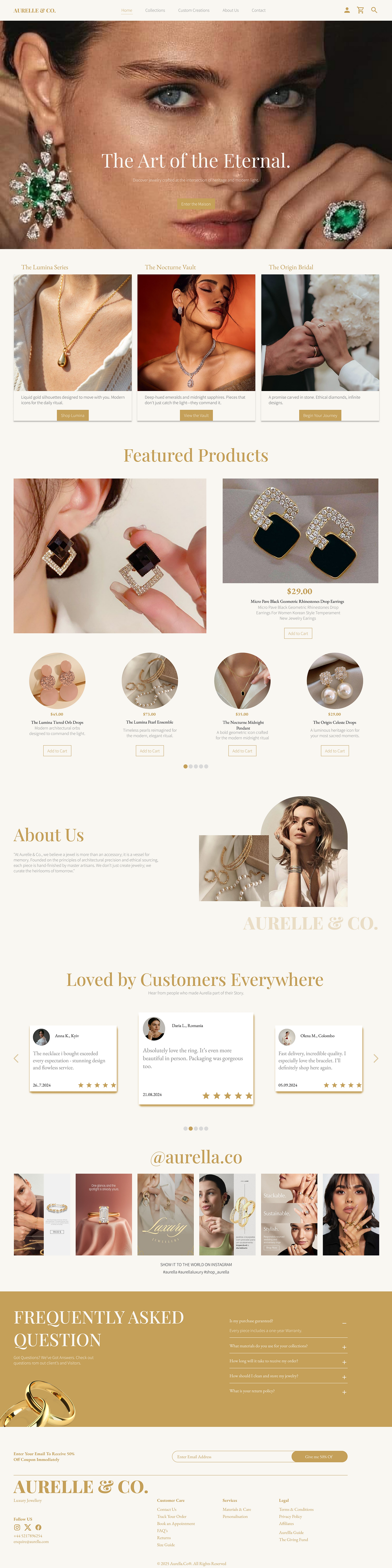
Aurelle & Co. is a luxury jewelry Maison dedicated to the intersection of architectural precision and timeless heritage. We believe a jewel is more than an accessory; it is a vessel for memory, handcrafted by master artisans using ethically sourced materials. From the radiant 'Lumina Series' to the mysterious 'Nocturne Vault,' our collections are designed to be modern icons for the daily ritual. At Aurelle & Co., we don’t just create jewelry; we curate the heirlooms of tomorrow.

The Challenge
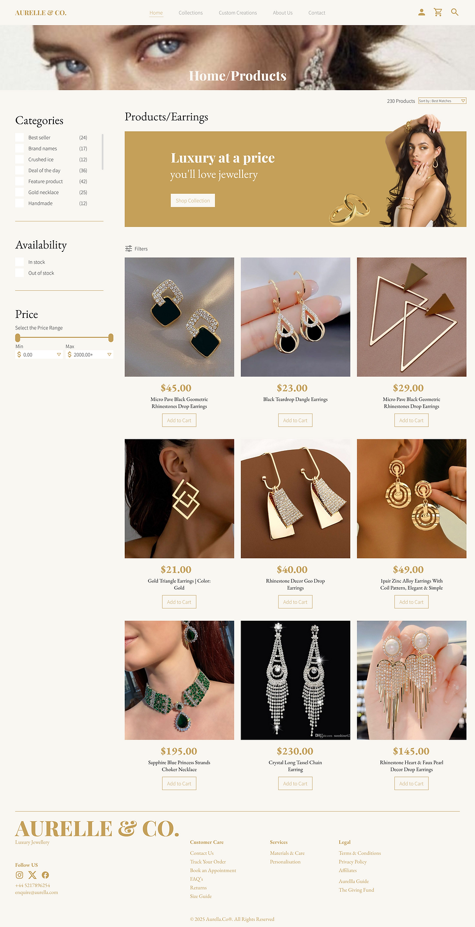
When a brand has many different styles (from pearls to black onyx), the shop can feel messy and disorganized, making it hard for customers to find what they want.

The Solution
I organized the jewelry into three themed "universes" or collections.
-
Themed Collections: I grouped items into the "Lumina Series" (daily gold), "Nocturne Vault" (dark gems), and "Origin Bridal" (wedding).
-
Smart Filtering: I designed a "Categories" and "Price" sidebar so users can quickly filter by material or budget without leaving the page.
The Result: A clean, organized shopping flow that guides the user to the specific "vibe" they are looking for.
USER PERSONA
Sloane
Art Director & Creative Professional
Sloane lives a fast-paced urban life and values "fewer, better things." She is tired of fast fashion and wants jewelry that transitions from a gallery opening to a high-stakes boardroom meeting. She views jewelry as a signature of her personal brand.

“ I’m not looking for a seasonal trend; I’m looking for a piece of history. I want jewelry that captures a moment in time and stays with me for a lifetime.”
Demographics
-
Age - 37
-
Occupation- Creative Directors, Senior Managers, Entrepreneurs, and Tech Professionals.
-
Family Status - Married, two children (Ages 5 and 7)
-
Income - Upper-middle to high disposable income ($85k+ USD annually).
-
Lives In - High-density urban centers of New York
Devices
for quick scheduling and purchasing
for detailed ingredient research
Traits
-
Quality-Obsessed: Despises "plated" jewelry that tarnishes.
-
Architectural: Loves geometric, clean lines
-
Ethically Minded: Wants to know where her gold comes from.
Needs
-
Versatility: Pieces that work with a blazer or a silk dress.
-
Longevity: "Heirlooms" that don't lose their luster.
-
Seamless Luxury: A digital shopping experience that feels like a concierge.
SAYS
THINKS

"I’d rather buy one solid gold piece this year than ten cheap ones."
"I want jewelry that feels like a secret between me and the designer."
"Does this brand actually care about ethical sourcing, or is it just marketing?"
"If the website looks cluttered, the jewelry probably isn't high quality."
"I'm willing to pay a premium if the craftsmanship is visible in the details."
"I need a brand that understands the 'Quiet Luxury' aesthetic."
Inspired by architectural design and clean, modern light.
FEELS
DOES
Wary of "influencer brands" that lack true heritage or precision.
Validates: Reads the "Materials & Care" section before looking at the price.
Research: Zooms in 100% on product photos to check the finish and texture.
Empowered when wearing a piece that feels unique and substantial.
Validates: Reads the "Materials & Care" section before looking at the price.
Grid Spacing
Grid Spacing
" A Design Structure that arranges elements neatly creating balanve and clarity on the screen."

Margin : 50px
Column: 12
Gutter : 20px
Colour & Typography
" A Design element used to convey emotions, create contrast, and enhance user experience through visual hierarchy ".
Primary Text - Playfair Display
Secondary Text - EB Garamond
Aa
Regular
Medium
Semi Bold
Bold
Extra Bold
Why: It has high contrast (very thick and very thin lines) which mimics the luxury feel of fashion magazines like Vogue.
Aa, Bb, Cc, Dd, Ee, Ff, Gg, Hh Ii Jj, Kk, Ll, Mm, Nn, Oo, Pp, Qq, Rr, Ss, Tt, Uu, Vv, Ww, Xx, Yy, Zz
1 2 3 4 5 6 7 8 9 0
Aa
Light
Regular
Why: Using a classic serif in italics for subheadings adds a sense of "hand-written" exclusivity and softness.
Aa, Bb, Cc, Dd, Ee, Ff, Gg, Hh Ii Jj, Kk, Ll, Mm, Nn, Oo, Pp, Qq, Rr, Ss, Tt, Uu, Vv, Ww, Xx, Yy, Zz
1 2 3 4 5 6 7 8 9 0
Body Text - Source Sans Pro
Aa
Regular
Medium
Why: It’s transparent and doesn't distract. It lets the jewelry photos do 100% of the talking.
Aa, Bb, Cc, Dd, Ee, Ff, Gg, Hh Ii Jj, Kk, Ll, Mm, Nn, Oo, Pp, Qq, Rr, Ss, Tt, Uu, Vv, Ww, Xx, Yy, Zz
1 2 3 4 5 6 7 8 9 0
Secondary Colour 1
#1A1A1B
Secondary Colour 2
#F9F7F2
Icons Used
Web View/ Homepage
Product/Catalog Page
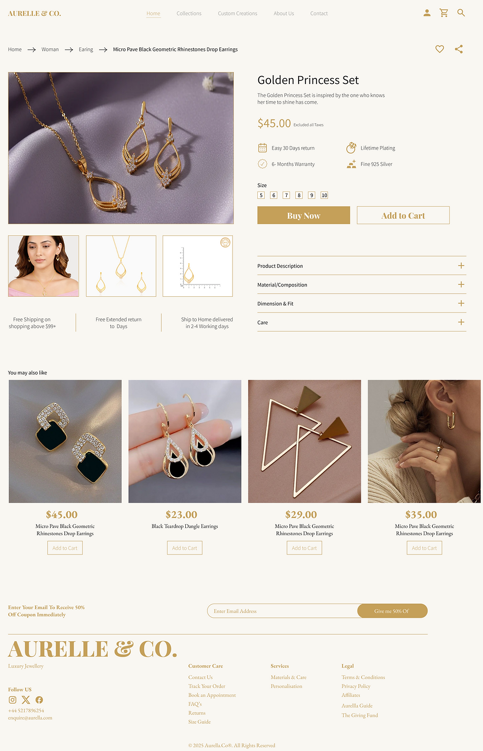
Product Details Page